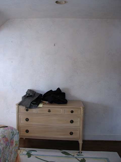
DC Design House Bare Bones Tour!

If you're free tomorrow, I'd love to see you at the DC Design House Bare Bones Day!  You can view the "before" of the empty house and view designers design boards for their spaces & talk to them about their plans.  I'll be there bright & early in my updtairs bedroom at 10.  (10 is bright & early for this mama who lives way out in the 'burbs ;) 

Tickets are $20 each and proceeds go to Children's Hospital. 

We're flying out to LA for the Design Blogger's Conference tomorrow late-afternoon so I'll be staying at the Showhouse until a little after 1 or so before heading to the airport. 

Here is a little peek at a photo of the grisaille "sketch" done by John Matthew Moore for my design board:

{I want to be there}

Outside of the house in DC, there are boxwood gardens so we thought this painting of English gardens would be fitting for the room.  This little painting is based on a photo Matthew took on one of his trips.   I cannot wait to see it enlarged!! 


{John Matthew Moore in his gallery}

Want another peek of his gallery?  (I thought you would so I took lots of pics!)  The Gallery in McLean is not completely finished but is still gorgeous:


{Recognize those robin's eggs paintings?}


{Some of the beautiful frames available... art in and of themselves}


{Loove these chairs... Matthew reupholstered them in a levendar-gray velvet with jute trim.}


{the desk}


{gorgeousness}


{I love these little sheep paintings hung in the window}


{The pedestal table displays some of lighting designer Rick Singleton's repurposed lighting projects}


{check out this antique beauty... I love the nailholes left over from its lifetime of different identities}


{And one last parting pic of the Gallery}

For information on Matthew, Rick and their work, go here.   http://johnmatthewmoore.com/

I met Matthew & Rick this past September when our good mutual friends, Eddie & Jaithan were visiting.  We went to the best little burger place around in McLean & had a great time.  I was literally blown away by their work & couldn't wait to use pieces of theirs for clients.  When the DC Design House came around, I immediately thought of Matthew & Rick & how amazing pieces done by them would be.  I was thrilled when they were on board to contribute to the bedroom!  They have both had pieces featured in past Design Houses and I kid you not, I got so excited I chills when I saw the gallery the first time with Eddie & Jaithan.  It just oozes with creativity and makes you need a piece for your own home. 

Throughout the next coming month or two, I'll be sharing photos & info on all of the people and companies who are contributing to my room in the DC Design House.  They're such a creative talented group & they've all been so generous.  The Children's Hospital Showhouse definitely takes a village and I can't wait for you to "meet" everyone! 

The Design House Bare Bones Tour tomorrow will be a lot of fun, so please come if you can!! 

For the address & info for tomorrow, go here.:  dcdesignhouse.com

xoxo, Lauren

If you'd like help creating a home you absolutely love, contact me about our design services.

Apartment Therapy Design Evening in DC


If you're in the DC area, come out to this month's Apartment Therapy Design Evening on March 16th.  I'll be speaking about design, my new fabric & furniture lines, the showhouse and other random things and would love to meet you!!  (Like I mentioned, public speaking makes me a little nervous so friendly faces would be a huge plus :)  It's a great chance to get to meet other bloggers & design-obsessed people and it should be a lot of fun.  So come out if you can!!

To see details and RSVP, go here
The location listed is tentative so be sure to check back prior to the event... they are trying to get a larger space. 

Fingers crossed! eeeeek

xoxo, Lauren

If you'd like help creating a home you absolutely love, contact me about our design services.

Newest Textile Design- Magnolia

I wanted to share another little peek of my new textile line...  This design is called Magnolia and my friend (and super-talented artist), Kat Wright, painted it for me.  It will be available in several colorways and here's a quick look at two of them, both on linen.

Here's the blue colorway:

{"Magnolia" in blue by Lauren Liess Textiles}

And here's the True/Green:

{"Magnolia" in true by Lauren Liess Textiles}

I had to use my camera phone & the pics really don't do them justice, especially the True.

I love magnolias and look out at my neighbor's massive magnoilia tree fairly often, wishing it were in my yard.  For this pattern, I wanted an overscaled pretty-yet-wild feel.  It's a floral but its leaves are just as prominent as its blooms which I think makes it a little less sweet.

I can't wait to start using these in projects ----   eeeek!!

I'm still working on finalizing pricing but hope to have them up and for sale in my online store by mid-April.

ps- I looooved your ideas about outdoor fabrics so am looking into it!

ppss-- I'm headed to LA this weekend to the Design Blogger's Conference and we're taking Christian to Disneyland!!  Let me know if you've signed up for the Conference!

Also, The DC Design House Bare Bones Tour is this Saturday from 10-4.  I'll be there so stop by if you can!  Click here for details. 

Finally, I'm joining up with Apartment Therapy on Wednesday, March 16th for a Designer Night in DC.  They're still finalizing the location so as soon as I know you'll let you know.  I definitely get a little nervous about public speaking so fingers crossed.


xoxo, Lauren


If you'd like help creating a home you absolutely love, contact me about our design services.

Home Design Ideas - 3 Tier Kitchen Island

A 3 Tier Kitchen Island is a simple Home Design Idea I have used many times over the years.  Most kitchen islands tend to be one tier or two.  On a single tier island one counter provides kitchen prep and eating / serving purposes.  On a two tier island one tier is the cooking counter and the second tier is the eating / serving counter.  I like to add a third tier because it adds another dimension and offers more storage possibilities.  See below for a few examples.

Three tiers - one for kitchen prep, one for eating and serving and one for storage.  Here we used glass doors for display.   I like the way the taller tier "anchors" the other two counters.  It also helps to define the edge of the kitchen from the hallway which is to the left.
Here (in our Excelsior Farmhouse) tiers on both ends "capture" the kitchen and eating counters.  The eating counter is highlighted with a natural walnut surface.  The taller end cabinets also provide another display surface.
Another simple example (from our Midwest Living Farmhouse) with a curved serving counter.  The taller end cabinets also help to conceal kitchen clutter from the living room beyond.  This is a good design strategy within an open floor plan.  


Garden of Giants

Why is it that when we're outside, we create spaces that remind us of being inside, and when we're inside we (well, definitely me) create spaces that remind us of the outside?  Outside we make "outdoor living" spaces, treehouses, fun sheds, outdoor kitchens, patios with rugs, etc...  and inside we want our windows wide open to reveal views of the outdoors, and we use natural materials & objects to bring nature in.  I'm really not sure why but I guess I'd say it's because we want the best out of both??  As humans, the outdoors is beautiful & awe-inspiring but maybe it's just in our DNA to make shelters and/or nest?  I'm guessing not everyone has this bug, but for those of you who have it, you know it's like that pregnant "nesting" stage for life. 


{image from Atlanta Homes & Lifestyles Blog}

I loved my treehouse as a kid... I seriously used to sweep it!! (and you know I hate cleaning)  Yet just as much, I loved sleeping with my windows open so that it felt almost like I was outside.  I loved camping outside but I loved going into the cozy tent to sleep. 


{our Girl Scout tents were soooo not this great... image from http://www.prospectortent.com/products.html }

Anyway, when it gets warmer out, my mind always goes to gardening & enjoying the yard.  Last year we planted wisteria along our fence and are a backwards with it, but are adding a pergola to our gate for it to grow over this year.  There's something about outdoor spaces that are just a tiny bit enclosed & private that I love. 


This year, we're planning something really special for the kids (&us)  thanks to this book my mother-in-law gave me:

{by Sharon Lovejoy found here}

It's called Roots Shoots Buckets & Boots and I am craaaaazy about it.  Seriously, it makes you want to go out and start digging.  I planted my daffodil bulbs this weekend after taking a peruse.  (I know I'm a couple of months late on that but I heard from  good source that they might have a shot?? )  In her book, Sharon Lovejoy outlines 12 different types of gardens you can make with y our kids.  (And honestly, whether you haev kids or not, these gardens are a-mazing.)   I want to do a couple this year but the one we're definitely doing is the "Garden of Giants."   It's actually a "living fort" that the kids (and me!) can play in.  They crawl through a tunnel of beans to get to a teepee of gourds surrounded by a giant pumpkin patch. 

{image from ArtisanArt.biz... how gorgeous are these hanging gourds?!!}

You have to wait to start planting until it stays above 70 on most days so we'll need to wait a while for that (umm... yeah snow storm coming tonight what???!!) but I CANNOT WAIT!!!  For anyone interested in joining us, you can buy pre-done seed packets for the Garden of Giants here or you can get them on your own. 

I'm curious to see how this turns out.  I love to garden {mostly on weekends} but am an impatient & neglectful gardener...  things that don't need a lot of tending (or um watering) do really well at our house.  So we'll see how this goes.  If it works, I'll take lots of pictures.

xoxo, Lauren

If you'd like help creating a home you absolutely love, contact me about our design services.

The Value of an Architect 2 - Architects have great Tools!

A recent project I am working on at Ron Brenner Architects gives me another example of how a good designer can add value to a project. The home is in the Design Development stage, so the basic form and plan have been finalized but the details are still being adjusted. The images below illustrate how Brenner utilizes 3d visualization tools (in this case Google Sketchup) to study variations in design to communication options to the client. With better visualization the client is able to make more informed decisions.


The image above depicts the completed Schematic Design - a classic midwestern farmhouse exterior. Narrow gable forms, 1 1/2 story height, shed porches and box out bays, white clapboard siding, black shingle primary roof and galvanized metal porch roof.


This image depicts a taller plate height and a modification of the roof eave detail to provide more of a midwestern greek revival aesthetic.


Image above represents mostly a color study variation of the original farmhouse vernacular design but also makes subtle adjustments to column sizes and porch beam detail.

This last image depicts the concept of an "original" brick farmhouse being added on to with subsequent white clapboard additions.


The Value of an Architect

While at my regular job - Ron Brenner Architects - I received a phone call a few days ago. It was from someone who had been designing their own cabin. Subsequently the design was given to a builder who's draftsman tried to complete the design and drawings. Well it turns out that he did not like the design. He was still enamored with the floor plans, but not the exterior appearance. The image below is of the original design.
I was asked to see if I could take a shot at improving the appearance of the home without significantly altering the floor plans. He also wanted to maintain the basic chalet style roof line that he had started with. I agreed to work on an hourly rate basis to provide the services. I modeled the plan quickly in Sketchup and did several minor alternatives. In the end we landed on the final solution as shown below.


Hopefully this is illustrative of a little bit of value an Architect can bring to a project. They can turn an ugly duckling into a beautiful swan. Good design is not easy. It takes training, creativity and experience. There are many aspects of design that need to be considered including:
  • form
  • scale
  • proportion
  • rhythm
  • pattern
  • texture
  • shade and shadow
  • color
  • spatial qualities
  • quality of light
  • function
  • circulation patterns
  • furniture placement
  • construction related issues
  • cost / budget
A good experienced Architect will be considering all of the above while creating beautiful design solutions for you. So next time you decide to build a new home, or remodel an existing one; you really ought to consider hiring a design professional. Your project will be better off for it.


Design House Progress

First I just want to say THANK YOU to all of the amazing comments you left on the last post.  We're definitely not alone and it's nice to know that.  I nodded, laughed and even teared up at some of your comments from yesterday's post.  Each & every piece of advice is awesome so if you didn't get the chance to read the comments, check them out. 

On a totally unrelated note, things have been progressing with the DC Design House.  In case you don't know how it works (I didn't until just a couple of months ago) I thought I might explain the process.  In December, just before Christmas, the house was open for two days so that designers could drop by, choose a room and measure & photograph it.  (Like I've mentioned before, the house is amazing.)  I was seriously nervous.  It's an interesting feeling to be in a room with other designers, measuring the same space.  Everyone was really nice though & there were no reality-TV drama moments or anything like that. 


{See the balcony?!! Looooove this house... and this room.}

We had a couple of weeks to put together a design proposal & board for the room we'd chosen.  We scampered around making phone calls for donations and getting everything just right.  We had an artist do renderings of our proposed space and we submitted the board and portfolio to be reviewed by the Committee.  That was on January 7th. 

We had to wait until January 31st to find out if we had been selected or not.  Twenty-four days doesn't seem like a long time, but by the last 3 or 4 days I could barely stand it.  I got a phone call that I had been selected (eeeek) and then it was time to get to work.  I got a different room from the one I had submitted a design for (I am thrilled with my new room!! :) so I had to change the design a bit.  (The room determines its design just as much as what someone wants to do with it.)

I got the chance to measure the new room and meet there with our contractors.  The new room needs something a little different than the what the first room needed, so I tweaked the palette and of course reworked the floorplan & furnishings to fit the new space.  Here's a quick pic of the original board being torn to bits as we tried to salvage the pieces of it that we are reusing in our new room:


{Don't get too attached to anything other than the Peter Dunham Fig Leaf fabric you see in the pic}

I created a new plan for the new room and we finished up the board today.  It'll be shown on Bare Bones Day, which is when people can tour the house to see it "before."  I'll be there and if you live in the area & are free, you should come check it out!  (info here)  We've spent the past couple of weeks sourcing the pieces that will go into the room, finalizing plans, and securing donations from generous companies & contractors.  It's been crazy because it's not a normal house you can just go to whenever you need something.  There are specific times you can go & meet with contractors and everyone needs to be on the same schedule. 


{design house room before}

The Bare Bones Tour is next Saturday and work begins the following Monday.  Our rooms need to be finished by March 31st.  Press Day is April 1st and the Design House opens on Saturday, April 8th!! 

I'll keep you posted as our room progresses.  First up is removing the current wallpaper!


xoxo, Lauren

If you'd like help creating a home you absolutely love, contact me about our design services.

What happens by Thursday...

...By the time Thursday rolls around at our house, it's trrrrrrrashed... Bad. 
In need of detox:

{There is this much food on the floor underneath my one year-old's high chair after every meal. 
Thank God I have a dog.}

Sometimes I look around and just wonder how in the world it happens?  How does a house get so destroyed in just 3 short days?  And the scariest part is, today's only Wednesday! Tuesday! (oh wow.  I totally wrote Wednesday and believed it until I realized my husband had class tonight, and he has classes on Tuesdays...  eeek)   We haven't even hit detox day yet!


{Clean me mommy!  Clean me!}

I sometimes wonder, "how do people do it?"  I only have two kids and it's madness here!  Last night my husband & I were hanging out in the kitchen attempting to make a yummy Valentine's Day meal, just enjoying each other's company for a few short minutes, when the dog came in, soaked and covered in PINK stuff.  And she smelled like strawberries!!

We followed her wet trail down the hall to our bedroom to find Christian (3 1/2) & Justin (1).  Justin was also covered in strawberry-flavored pink stuff literally from head to toe. 

Kids' toothpaste.  Awesome.

It was really hard not to laugh- especially when after a quick glance around my bedroom I could see that my room was okay (only half-kidding)...   And especially when it was one of the nicest-smelling messes our house has ever seen.  So I sort of laughed and hid my head and this time Dave got to be the stern parent.  All was well.

Christian has started reminding me of a little boy from Lord of the Flies. His hair goes wild at night and when he wakes up in the morning he rips all of his clothes off for his bath... but way earlier than need be.  We just need a fire.


{Christian... }

But anyway... my question...  how in the world do people do it??  I imagine nice calm breakfasts like in Lady & the Tramp where the family sits and eats and then everyone goes on their merry way.  Each dish is put into the dishwasher and the beds are made.  We rush around like crazy people in the morning and trash our house.  Why??

Case in point:  my husband just walked downstairs to where I am now writing, saying "I cleaned and I picked up, and I cleaned and I picked up, and I cleaned and I picked up..."  (I got all excited here) "...and it's still trashed."  oh.  And then he walked down the hallway and I heard,  "ooooooooooohhhhhhhhhh!" and I will not tell you what he found because I still have maybe half an ounce of self-respect left but let's just say the dog's in trouble. 

The strangest part about all of this is...  I'm coming to terms with the mess, which is a little scary.  I know we fix it every week and I know it comes back every week.  It's inevitable and I've found it interesting to observe that Thursdays really seem to be the culmination of the mess.  (And a little freaked out to realize that today is only Tuesday and it looks a lot like a Thursday around here.)

So anyway...  every so often I bring up this topic on the blog, because every so often I need to make changes.  Sometimes I just want to sit down and give up on fighting the inevitable mess.  (Ummm... and sometimes I do.)   BUT, it's at times like this when we need to FIGHT THE FIGHT.  (Yes, I'm pep-talking myself here.) I have to remind myself that if we don't keep cleaning, the goverment would have to come dig us out of our house.   No really though...  if we don't keep trying, life wouldn't be as great.  It's hard to enjoy the people you love when the mess is eating them.  We have to periodically come up with new solutions to force ourselves (and our family) to keep the house neater...  to change our natural tendencies into ones that don't require detox Thursdays.  I'm too tired to come up with any enlightening solutions right now, but my question is-  how do you do it all?

xoxo, Lauren


ps- This post here from last year is a bit more helpful  (as are the comments) if you're looking for some solutions to this problem! ;)

Home Design Ideas - Cozy Fireplace

Here is a another post from our Home Design Ideas category.  Create a Cozy Fireplace with an Inglenook layout.

Below is an interior remodeling of a home I did a couple of years ago.  The house was a classic 1950's Ranch - enclosed spaces, dark, uninviting.  As part of the remodeling we opened things up, brought in more natural light, and added a few more traditional details to the living room and other spaces.

The Living Room was the one large space in the house.  It was actually uncomfortably long which made planning an intimate furniture arrangement difficult.   So on with the Inglenook idea.  Think of an inglenook as a cozy kind of alcove space; which is exactly what we created.  See the pictures below.

The Inglenook was created by adding the new formal opening with columns just a few feet in front of the fireplace.  This served to shorten the room while still maintaining an open view to the fireplace.  In fact it even strengthened the fireplace as the focal point in the room.  

On either side of the fireplace we crafted a bench with recessed bookshelves above.  Detailing of the fireplace surround, paneling and columns is a spare level of traditional.  Color tones are subtle allowing the natural wood floor and brick fireplace to stand out.
All in all we were successful in creating the type of space our client was looking for - Simple, Unique and Elegant.

Copyright 2011 Simply Elegant Home Designs

Brooke & Steve's Gilt Showhouse Room!


I'm so in love with this room by Brooke & Steve Giannetti for the Gilt Home/ Ashton Kutcher Showhouse.  The online sale of a select number of pieces from each room are on sale though tomorrow.  A portion of the proceeds will be donated to DNA, a charity started by Ashton Kutcher and his wife Demi Moore to combat human trafficking.  To shop and help the cause, go here.  (Can you believe the water paintings are Steve's?!!)


xoxo, Lauren

If you'd like help creating a home you absolutely love, contact me about our design services.

DC Design House Room Before

{My DC Design House Room, Before}

Yesterday was a long crazy day in the city (I'm pretty much a total suburban girl) and I have before photos to show you of our room!  My assistant, Meghan Short, has been invaluable.  (Meghan graduated last Spring with an interior design degree from JMU- go dukes!- and I'm very lucky to have her.  She's seriously talented and just "gets" it.)  To give you an idea of what our mornings are like when we head to the Design House...  Mine starts around 6:30 laying in bed pretending I don't really need to get up... oh wait, that's not what you wanted to know??   sorry :)  ....Meghan arrives at our house at 8 and helps me get the boys out the door to daycare by 8:30 or so... which has been a lifesaver.  (Any of you with kids know that getting out the door with 2 under 3 is no small task.)  From there we head straight into the city and arrive by 10.  

When we got there yesterday, there was an introductory meeting with the members of the Committee and all of the designers.  We got the rundown on the house, dos & don'ts, cans & can'ts etc.  It was fun seeing so many faces I'd only seen in photos!!  (And some familiar ones too!)  

Ok, and now what you really want to see... more of our room "before:"

{The right wall when you walk in}

It's approx 12x16.5 feet and I love its proportions.  It's currently wallpapered.  There are funky angled walls & a cozy bay window nook. I'm crazy about it!!

{The left wall.  We do have to work around the air conditioning unit in the window...  And it actually needs to be running during the Showhouse.}

Here's the view looking at the entry door.  The door on the right is a little closet:


We met with insanely talented artist John Matthew Moore who is creating something I can barely sleep over for our space, lighting designer Rick Singleton wose work I loooove, the BEST carpet guy around -Tolvin Griffin- who owns Carpet Customizer (he is cutting, binding & installing a Stark rug for us), and our new go-to builder- Mike Carr with CarrMichael Construction -who is doing the brunt of the work.  They are all generously donating their talents and this room would not be possible if it weren't for them.}

We are planning something for the bay window but need to work around the radiator.  Here's a pic Meghan snapped of Mike & I figuring out the best way to make it work:


And here's a pic Meghan snapped of what it {sadly} looks like when I'm working:


We typically spend much of the palette-planning stages on the floor in my office, so I was pretty at-home with the lack of a table in our empty room. 


And one last shot of the room "before:"


I absolutely love this house & wish I could move my family right on in.  It's a 1920s tudor with beautifully proportioned rooms - both dark & moody and sunny & light like ours- and a million little nooks & crannies.  It's the type of house you wish you could be a kid in & just run around exploring & playing hide-and-seek.   In the master bedroom closet, you can open up a wardrobe door and there is another set of doors that opens onto a balcony overlooking the massive formal living room.  I can just picture it filled with people at a glamorous party, Sound-of-Music-Style.


(yeah, I totally thought it was "Avida say goodnight" until I googled it.)

xoxo, Lauren

If you'd like help creating a home you absolutely love, contact me about our design services.

Check out DC Design House details here
Copyright © Home Styles. All Rights Reserved.
Blogger Template designed by Click Bank Engine.