#3 I'm Shopping for... A Range Hood

We're presenting a design to our clients for a kitchen redo in a couple of weeks & I'm really excited about it.  This kitchen needs to work with the other spaces we've already designed in the home so it will be sort of a relaxed natural-feeling space with a little graphic edge   It will have lots of textural elements that you just want to touch and a big mix of materials & finishes for a casual practical & warm vibe. I'm now getting down into the details of the kitchen design and an important one that truly affects the mood of the whole kitchen is the range hood. 

{Kitchen by Darryl Carter = looooove!}

When perusing through images of kitchens whose range hoods appeal to me, I noticed that many of them had range hoods that stood alone vs. ones that were flanked on both sides by cabinetry, which is what we'll need for the kitchen we're redesigning.  While I think stand alone range hoods are A-mazing (on my personal wishlist one day) they don't always fit into existing kitchens because of space & storage needs, so I've been on the hunt for a pretty yet practical solution for our range hood that will need to be flanked by cabinetry.

One of the things seen a lot in "real life" kitchens is the microwave with exahust fan below it over the range:


{image source here}

While this is completely functional & works for a lot of people (I've had it myself in the past & I think almost everyone in my family has it too) it doesn't create that gorgeous focal point we need for the kitchen & the vibe is totally different.  It doesn't have as much of that "working kitchen" feeling we're after. (And the small cabinet above the range hood isn't really adding a ton of storage space.)

Another thing seen a lot in typical kitchens is the mini vent hood above the range topped with small upper cabinets:

{image via pinterest}

Again, I think it's really functional, (and looks great here in the adorable kitchen above) but it still doesn't have the same impact as a full fange hood.

...Although I have to say that in the high-ceilinged kitchen below with the larger cabinets above the hood, it's making a pretty big statement but I think it's more due to the massive wall of cabinets & the impact they're making.

{image via houzz/ pinterest...  couldn't find original source}

...But anyway, in the kitchen we're working on, I'm really looking to do a full hood that will be flanked by upper cabinets.  I've been collecting inspiration images & thought I'd share.  The first group up is of angled metal hoods.   For this kitchen, because we want to mix a variety of finishes, I like the idea of doing a metal hood.

Below is a picture of a shorter hood mounted up at the ceiling.  This kitchen actually looks like it might be shorter than 8 feet to me...


{Image from bhg.com}

Here's a photo of a hood mounted at the ceiling again, but this one is longer.  I think for our clients' kitchen that the longer look will work better as I want the hood to make more of a statement.

{metalmastersnw.com}

 This curved copper hood flanked by glass cabinets is gorgeous: 

{Southern Living}


I also really love the curved sides of this hood (below) but our clients' kitchen isn't quite big enough to handle this:


{image via pinterest}

The next group of metal hoods swoop down in an arc & I think would work beautifully even in smaller kitchens.  Here's another copper one:


{From segretofinishes.com}


I love the look of this kitchen.  The hood is perfection to me.
 
{sooooo gorgeous by Jim Howard featured in House Beautiful}


Here's a shorter version...  SO beautiful, but again, I think we need a bit more length in ours:

{image via decorpad.com}

This hood (below) has a little stainless stell shelf below it which is so pretty, especially with the lights on:

{image via alifesdesign.blogspot.com}

This hood blends right in with the wall & I think it could work for a seamless look between cabinets:

{redonline.co.uk }

This angled wooden hood is really interesting:

{atlantahomesmag.com}


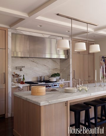
 Again, I love these massive  hoods (below).  They look particularly good when inset into the wall like this.  I love how they carried the hood over the countertops too instead of just the range.  Interesting trick to get some drama without the height.


{Hosue Beautiful}

Here's another inset beauty, except this time in wood:

{Better Homes & Gardens}

 The next few hoods are painted wood to match the surround cabinetry.  It's a classic look:


{image via houzz.com}


Looooove this curve:


{Kitchen by James Michael Howard}

...And don't pot fillers just make a kitchen look so perfectly practical?  "I want that!"


{image via decorpad.com}

I love all of these wooden hoods, but like I mentioned, for our clients' kitchen, I think we need a separate material for the hood.

{image via justinetaylor.tumblr.com}

The standard chimney hoods would work perfectly.  I think they look amazing between cabinets: 

{image via The Decorista}

This one (below) is narrow and I love how this style calls attention to the tile backsplash:

{Better Homes & Gardens}

Here's another one and I think they work beautifully for smaller kitchens:


{House and Home....  mm mm mm!}

..And one last one in black, which would work perfectly for us.


{Elle Decor...  We are including very similar wood tones in our clients' design & I looooove this!!}

Anyway, I think adding the right hood can really make a kitchen and take it to the next level so I want to be sure to get just the right one.  What do you think?  What's style of hood would you pick for your dream kitchen? 
xoxo, Lauren

If you'd like help creating a home you absolutely love, contact me about our design services.

ps-  If you are in the DC/ MD/ Northern Virginia area, our good friends Eddie Ross & Jaithan Kochar are coming this weekend for the DC Flea!!  They have a few spots left & I had the most amazing time when I went a few years back.  It's sooo worth it & they are so much fun.  They are some of our most supportive & loyal friends and if it weren't for my husband & I going on that flear market tour with our then-baby-Christian, we might never have connected with these amazing guys.  To read about the flea market tour & sign up, click here.

Love this Milk Bottle

You know those little things you find that are really no big deal but just make you so happy? They get you just a teensy bit more excited to do some sort of mundane thing?


Well, I found this adorable little milk bottle at Target the other week.    I've been filling it up at night so it's all ready to go for breakfast & because of this little bottle, I get to sit down so much quicker in the mornings & the table looks prettier.  Instead of standing at the bar fixing cereal for the kids with the gallon, I can just plop the bowls on the table with the cereal and SIT without having to go back to the fridge for more milk for seconds.  (That may not sound like such a big deal , but I'm pregnant and it is to me in the morning ;)   


It holds enough for a few bowls of cereal and a couple of little glasses of milk which is just right for us.  I've been using it for other meals too.  (Normally we have dinner all ready & we sit down & have forgotten our drinks & one of us is back up getting drinks.  Pretty much always.  Well, with the magic milk bottle (it's getting higher up in importantance to me as I write this post) we can just set out the glasses when the table's being set and plop the milk bottle on the table.  (It stays cold for a while too!)    I love this thing!!

I might have to go get more of these.  I'm not sure how many I'd need to empty a gallon... 

ps- I can't believe I just wrote an an entire post about a milk bottle, but I guess that's what blogs are for, right?

xoxo, Lauren

If you'd like help creating a home you absolutely love, contact me about our design services.

Client's Living Room Before & After

A couple of years ago around Christmastime, I was contacted by a husband looking to give his wife a design consultation for Christmas.  He bought her a gift certificate & surprised her with it.  We met a month or two later & had a two hour consultation in their home.   I've always thought this was one of the sweetest things ever & thought about the clients from time to time.  She & I had sort stayed in "cyber" touch, and I was thrilled when they contacted me this Fall to redo the living room in their new home.   I would describe their style as very cozy, warm & a bit English.  (Which makes sense as the husband actually is English!)They started with a white box: popcorn ceilings and wall to wall white carpet. They were SO ready to get the house feeling like them and were thrilled to ditch their existing pieces for new ones that reflected their taste.

Here's the room before:

(That's Bailey on the floor :)

And here it is now:


A natural woven rug & shades are on their way but I think the change is already incredible.  CarrMichael Construction ditched the popcorn ceilings and replaced the carpet with hardwood.  The walls were painted  in Benjamin Moore's "gentle cream" to warm up the room.  We kept their existing Victorian wing chair (which is SO similar to my Madhatter chair!!) in its original fabric and added a super-comfortable English arm sofa, storage ottoman for toys & puzzles for their little cutie pie, and skirted wing chair.  My client found everything for the walls at flea markets, antique shops & thrift stores.  (Go Emily!! :)

Here's the other side of the room where there was an awkward opening to the stairs that prevented them from having a balanced seating area and the cozy feeling they were after:


And here it is now, all closed up:


I love the little rush seat bench between the windows:


Here's a close-up of Emily's 'found' artwork above the sofa:


{Sofa pillow fabric: Ralph Lauren floral, Michael Smith's Indian Flower & a discontinued olive green paisley}

I think my favorite little spot is this skirted wing chair with the "goddess" floor lamp:


And finally, here's one more shot of the whole room:


Anyway, I'm off for the day but hope you enjoyed!!  We have another one tomorrrow so I'll be sure to post pics when I can.

xoxo, Lauren

If you'd like help creating a home you absolutely love, contact me about our design services.

Also, I just wanted to add, that due to time contraints & our project schedule, we are only able to take on full-service projects like this one (vs. design consultations like the one I mentioned at the beginning of this post).  I'm looking into the possibility of adding staff & making design consultations available again in the future, but for now, it's full projects only.  I will be sure to let you know if / when this changes!! :) 

Remember Our Old Bathroom Sink?

We moved into our 70s fixer upper 2 and a half years ago and had to make a few quick & easy fixes...  One of them entailed painting our boys' GREEEEEN bathroom sink white with a porcelain painting kit about 2 years ago.  It's also the guest bath on our main level so everyone sees it.

Before:


After:
{To read about that process 2 years ago, click here}

 It worked okay for about a year or so but then it started peeling.  (And we lived with it peeling for a bit too long- sorry guests!!)  

I would still recommend the product we used for temporary fixes...  It honestly made things better without much effort or money spent, but it's not a permanent solution, as you can see here:


I've been a little embarrassed everytime guests use the bathroom & have been meaning to replace it for a while now.  A couple of months ago we bought the Ann Sink from Ikea which I love.  I still didn't really want to spend much in the kids' bathroom & I went for another rather quick fix with this baby:


I bought a beautiful chrome fixture from somewhere else with standard specs to go with it but when we tried to install it, of course it didn't fit Ikea's specs on the sink.  SO...  back to Ikea we went (a month of so later I might add) to get the fixture they'd made for the sink, which I wasn't very happy about.
...BUT...


..I actually think it looks great!  I don't mind it as much as I thought I would (or really at all to be honest) and I am so excited about this thing!!!  (Is it sad that that's all it takes for me??) My husband's been a little busy with work/ home lastely so we actually had it installed by our contractors.


No more water splashes on the wall behind the sink and NO MORE GREEN!!! wahoooo    There's even a little ledge for soap and a little pretty something.

Next up:  Adding a #3 towel rod in there for the little one on the way!!  (see reflection in mirror ;)

I'm off for the day but have a beautiful weekend!!


xoxo, Lauren

If you'd like help creating a home you absolutely love, contact me about our design services.

And thank you to the guys at CarrMichael Construction for the great work!!

9 Years ago today...

I was a college junior at JMU.

{Yeah National VB Champs!}

9 years ago today ...  a bouquet of thistle & roses was delivered to my apartment door with a note from the cute boy I liked in my Creative Writing Class.

{Image from seaofblossoms.blogspot.com}


9 years ago today..  The cute boy took me out on a "Surprise" Valentine's Day date to see Shakespeare's Twelfth Night.


{image via wikipedia}


9 years ago today...  The cute boy cooked me one of the worst steaks of my life & smoked out his kitchen:


9 years ago today...  my husband asked me to be his girlfriend. 

{The very dirty & wet garage where beer pong typically ensued}

And for the past 9 years, we've grown up together.


He's my best friend in the whole world & I love the family & the life we've made together.   

Happy Valentine's Day to you & yours. 
.


xoxo, Lauren

If you'd like help creating a home you absolutely love, contact me about our design services.
Copyright © Home Styles. All Rights Reserved.
Blogger Template designed by Click Bank Engine.